Marisol Alterations
Overview
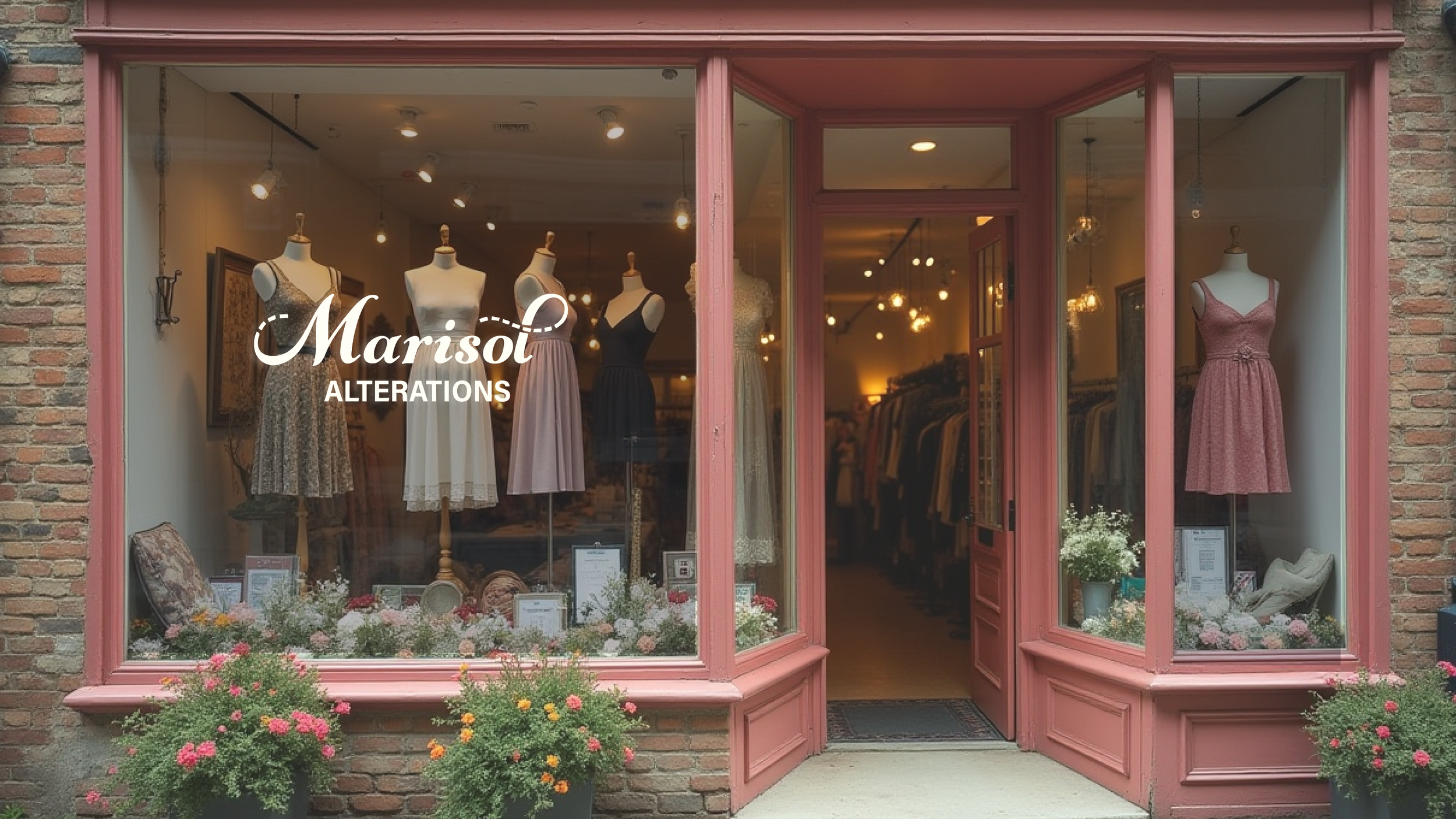
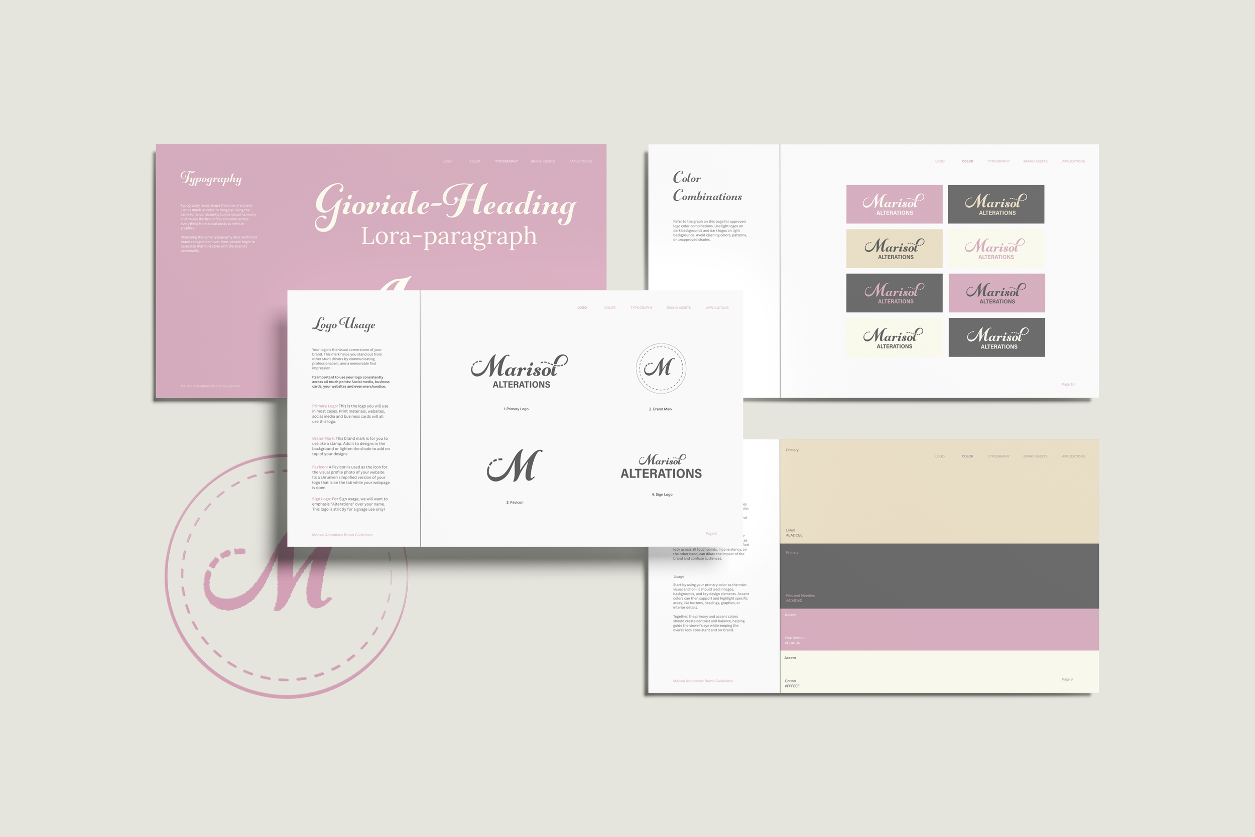
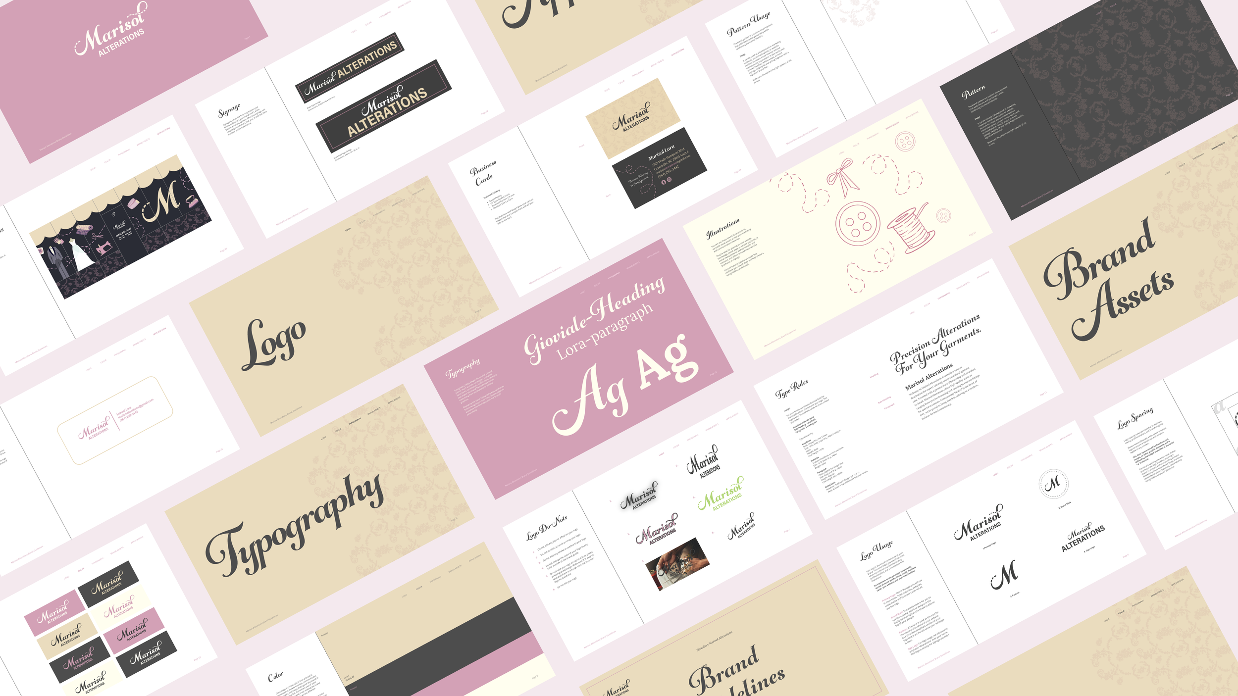
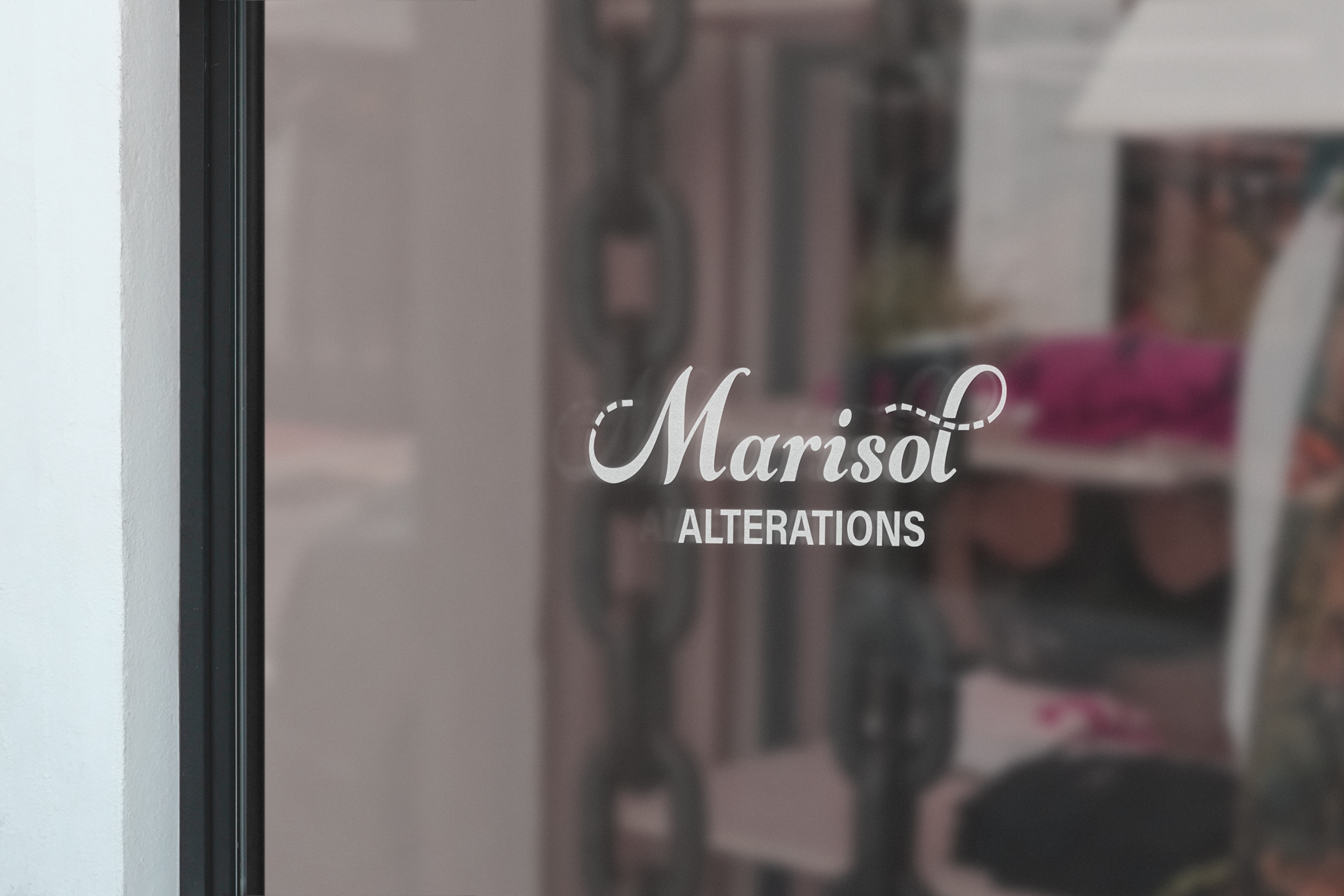
When Marisol’s dream building became available, she moved her business Marisol Alterations into the new space. With the upgrade came the need for a refreshed look that included a new sign and a cohesive brand identity. She came to us seeking a professional and welcoming brand that would draw customers in. Her vision included soft pink and cream tones, along with a logo inspired by classic European shopfronts that felt feminine, cursive, and timeless.
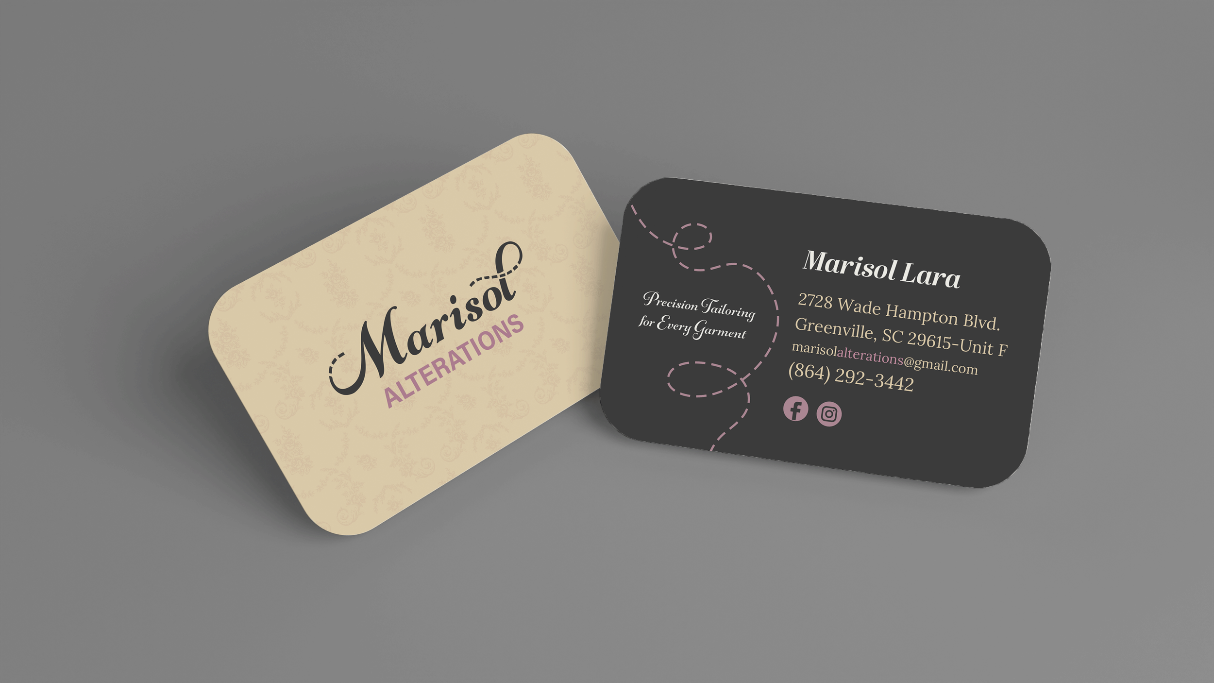
We created a flowing script font that is both elegant and highly legible from the road, achieving the right balance of beauty and functionality. Today, Marisol’s stand-alone shop in Greenville, South Carolina features signage and business cards that match her chic pink interior and provide a polished and inviting customer experience.
Branding Identity
Website Design
Print Design
Logo Design
Eniromental Graphics
Signage
Marisol Alterations Facebook